Identity
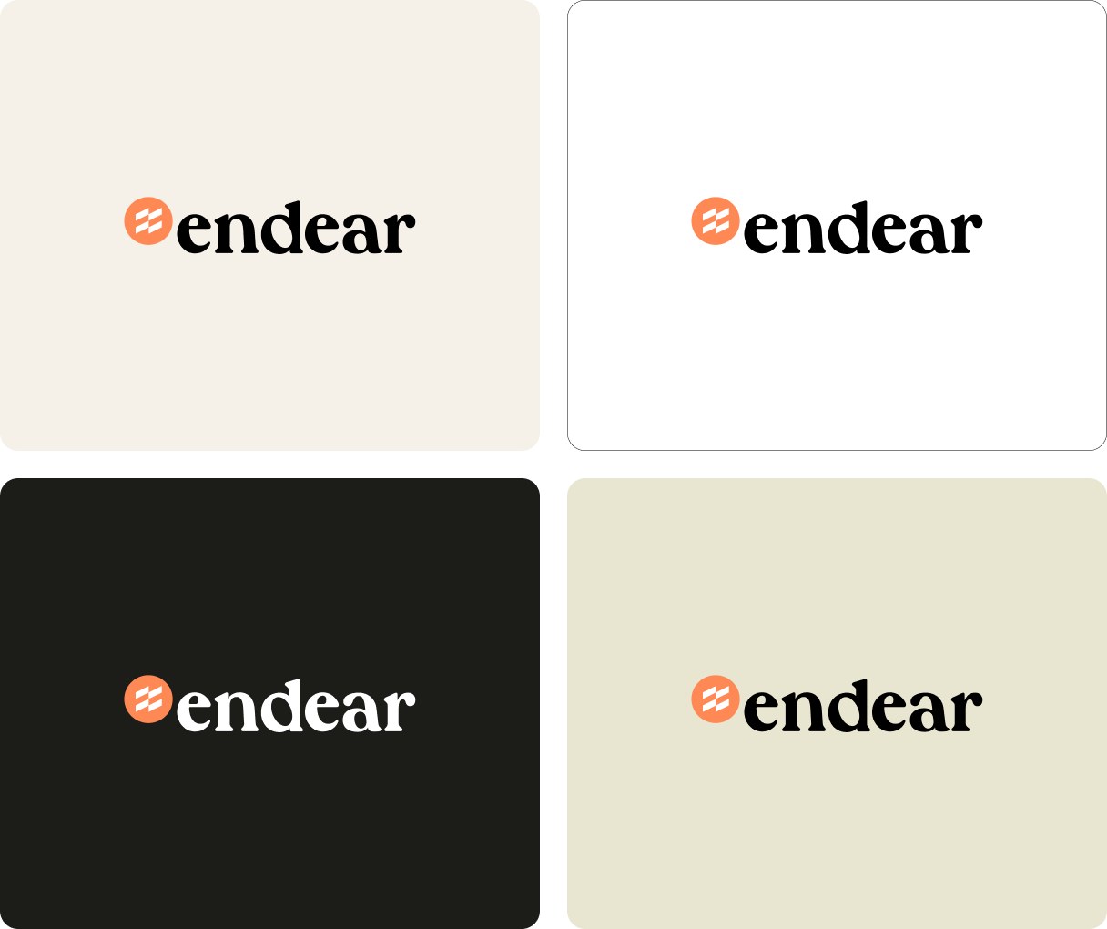
Our current mark pairs a terracotta disc holding three stacked bars with a heavy, lowercase soft-serif wordmark. It is the warmest identity in the set and the only one built on a serif.
- Warmththe rounded serif and the terracotta feel closer to hospitality than to software, which already points towards the world we sell into.
- Lowercasefriendly and approachable, right for a tool store associates open every morning.
- Weightthe wordmark is heavy and slightly dated. Next to GANNI or Reformation on our own logo wall, it feels closer to a café than to fashion.
Website
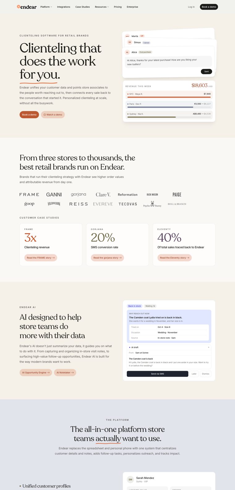
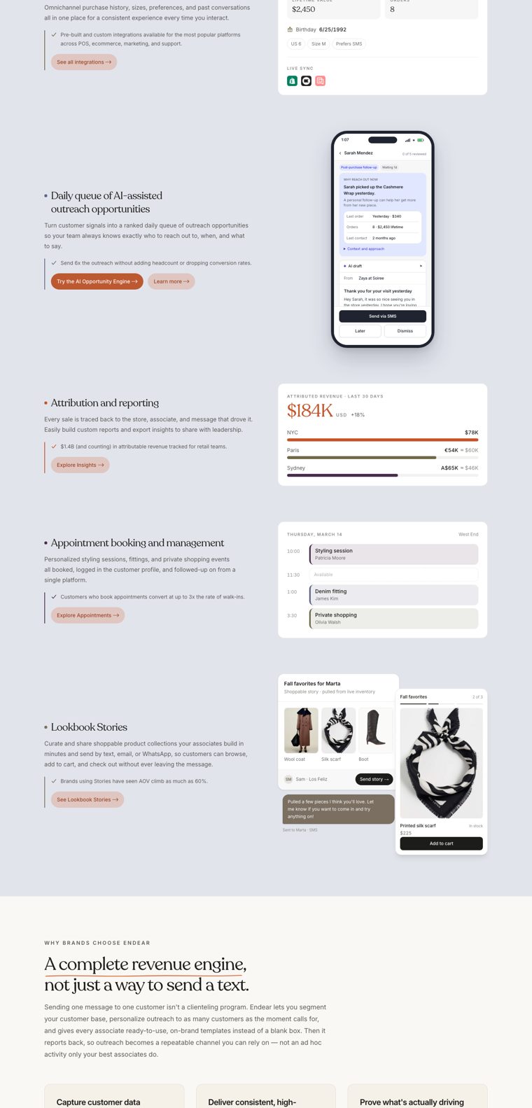
A clean, well-built page that explains the product clearly, but sells the tool more than the reason to use it.
- Tonewarm and calm, it stands out against the purple and black competitors.
- Productreal UI with believable data, like an associate texting a client that her coat is back in stock.
- Proofa wall of 14 fashion brands and three case-study figures (FRAME 3x clienteling revenue, gorjana 20% SMS conversion, Eleventy 40% of sales).
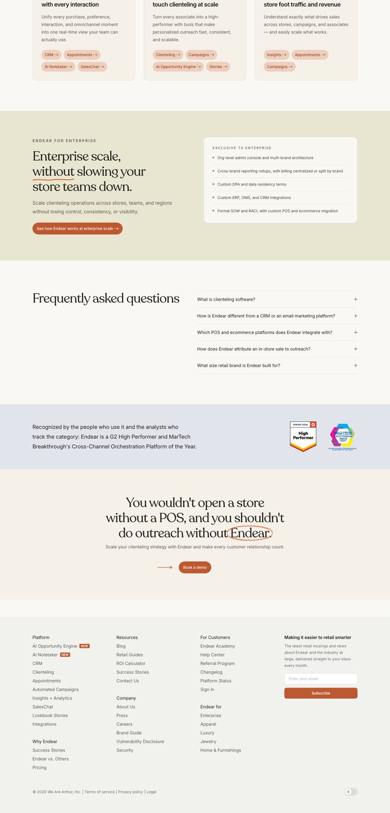
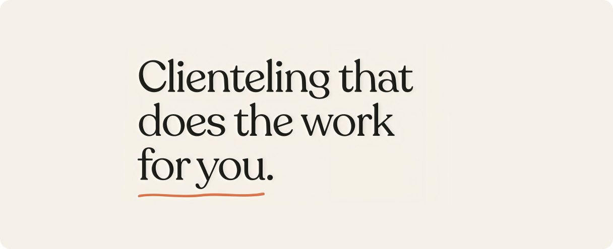
- Headline“Clienteling that does the work for you” could front any SaaS tool.
- Peopleno photography, no stores and no customer quotes on the homepage.
- Colour breaksthe cool slate and lilac UI sections drop the warmth exactly where we show the product.
Typography
We pair Recoleta, a soft display serif with a 1970s feel, with Inter for everything else. Headlines run at 80px with tight tracking; body copy is Inter in warm grey.
- Contrastserif headlines over a neutral sans is the right structure for an editorial direction.
- VoiceRecoleta’s round terminals give the copy a friendly, conversational tone.
- Recoletaone of the most used “friendly serifs” of the last five years, common in DTC food and wellness brands. It is soft where fashion is sharp, and it lacks the authority of a fashion masthead.
- Intercorrect but anonymous. It is the default of the SaaS look we want to leave.
- Display
- Recoleta Regular, 80/80, −2px
- Text
- Inter 400 · 500 · 600
- Weights in use
- 5
Photography
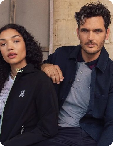
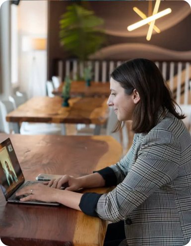
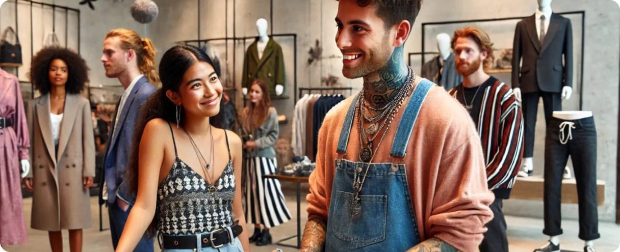
Our homepage shows no people: product UI, three cut-out garments (a coat, a scarf, a boot) in a lookbook mock-up, and the logo wall. Photography only appears on inner pages and blog covers, as bright lifestyle shots of shoppers and associates in stores.
These images change light, styling and casting from one page to the next, and no art direction holds them together. For a product built on the relationship between an associate and a client, this is the biggest gap in our identity.
The cut-outs are the right instinct: real product, shown the way a brand would show it. That is where the editorial direction can start.

Digital Comms
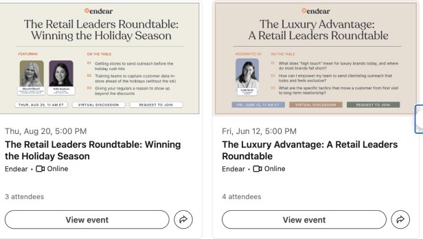
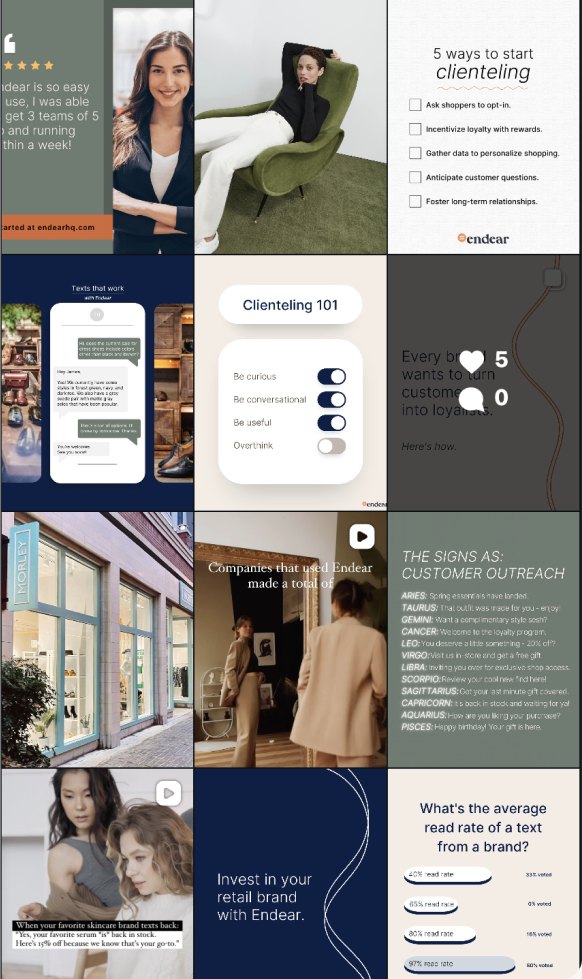
A small but active presence, none of it linked from endearhq.com. Instagram @endearhq has 188 followers; LinkedIn is used mainly to promote events.
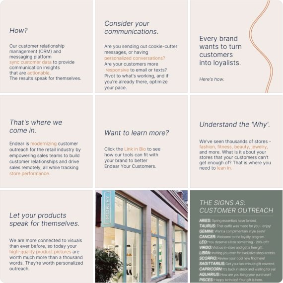
- The Instagram grid has a recognisable system: sage, navy and cream cards with practical clienteling tips, mixed with in-store photography.
- LinkedIn hosts the Retail Leaders Roundtable, a recurring event series with one consistent cover format.
- The feed reads as a content calendar. Few posts show real customers, stores or the product in use.
- Social runs on sage and navy, not the cream and terracotta of the website.
Digital Comms
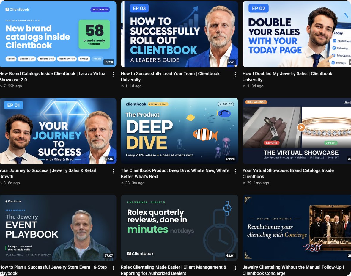
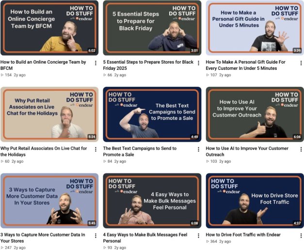
Facebook (511 followers) repeats the Instagram cards. YouTube @endearhq (42 subscribers, 16 videos) holds an older series of how-to videos.
- The YouTube series is practical and easy to follow, with clear titles such as “5 Essential Ways to Prepare for Black Friday”.
- Facebook and Instagram share one card system, so the brand looks the same on both.
- The smallest audiences in the set: BSPK has 3.6k YouTube subscribers and Tulip 17.6k LinkedIn followers.
- YouTube thumbnails follow their own template, unrelated to the website or Instagram.
We are already the warmest brand in the set. On social, that warmth is not yet visible.

Identity
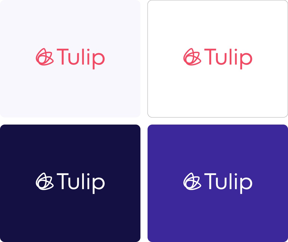
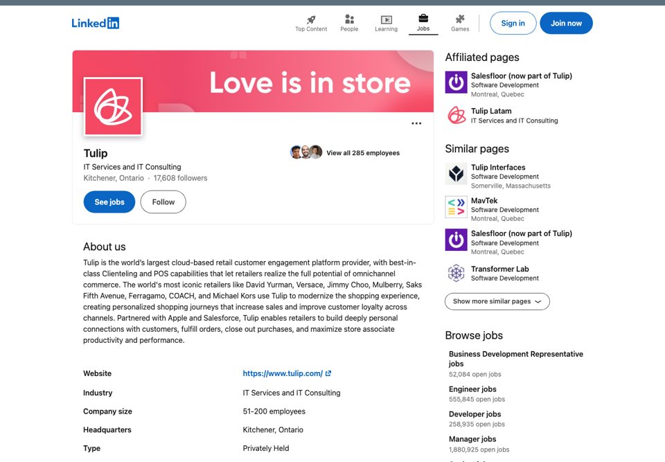
A combination mark: a line-drawn tulip built from overlapping petals, next to a geometric sans wordmark, both in coral. Competent and clearly a category leader’s mark, but it would suit a florist as well as retail software.
- Ownable nameshort and memorable, and the symbol translates it directly.
- Colourcoral is distinctive, especially on the dark purple ground.
- Literal symbolthe flower illustrates the name instead of an idea. Nothing in it speaks of clients, stores or selling.
- Generic wordmarka geometric sans with no detail of its own. Without the coral it could be anyone’s.
Website
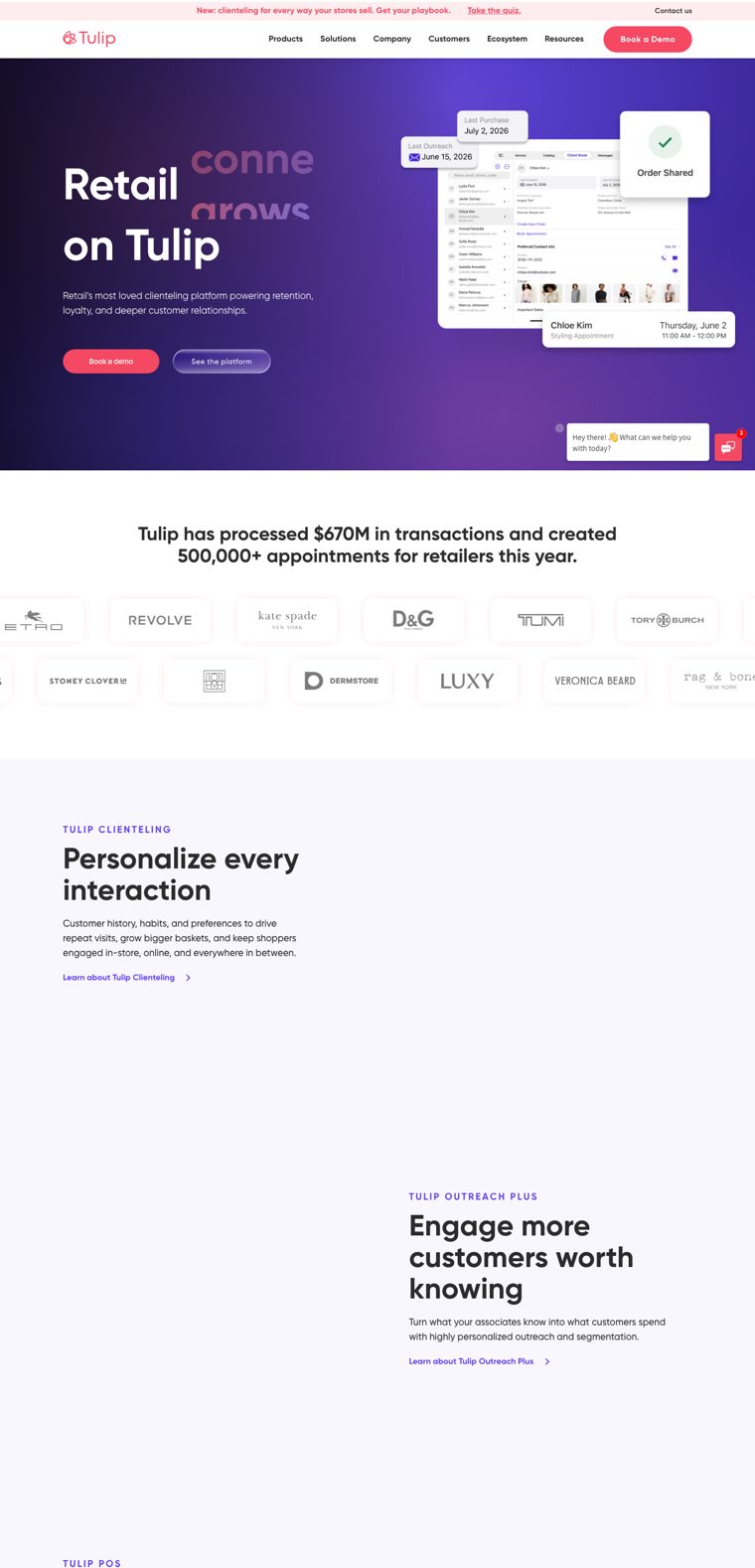
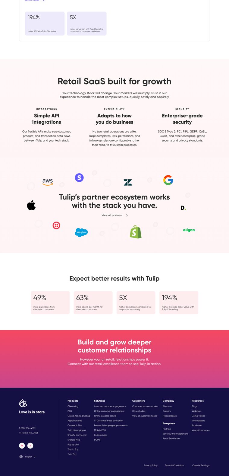
The most complete sales page in the set, with the most generic look.
- Proof up front“Tulip has processed $670M in transactions and created 500,000+ appointments for retailers this year.”
- Logo wallMax Mara, D&G, TUMI, Tory Burch and David Yurman give instant luxury credibility.
- Confidencethe rotating hero (“Retail runs / grows / connects / scales / wins on Tulip”) is category-leader language.
- Lookpurple gradients, gradient text and floating UI cards, the visual language of most SaaS sites.
- Motionlarge sections only come alive when animated. Static, the page feels empty.
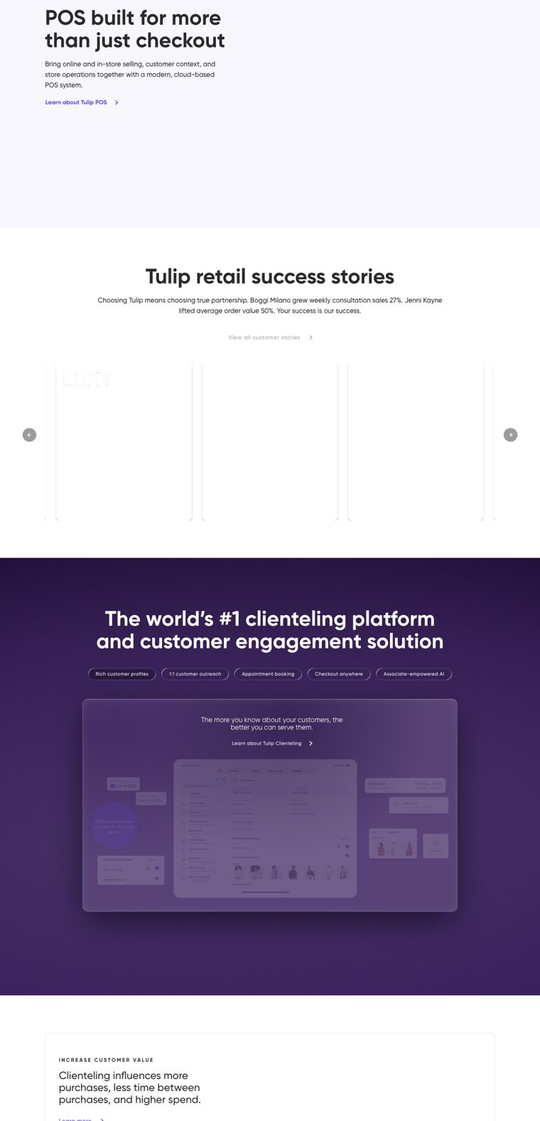
- Claims“The world’s #1 clienteling platform” is a claim, not a reason to choose them.
Typography
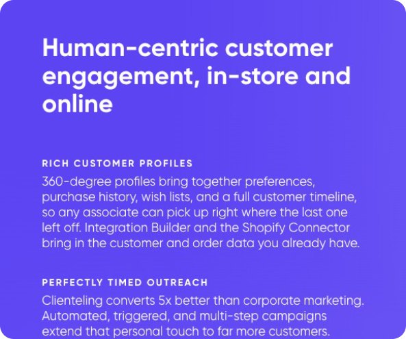
Gilroy throughout, from 84px bold headlines down to body copy. A rotating verb (“Retail runs / grows / connects / scales / wins on Tulip”) and a pink-to-violet gradient on one word carry the hero.
- Claritybig, bold and easy to read, it holds up on dark backgrounds.
- Gilroyone of the most common geometric sans in SaaS marketing. Nothing in it suggests fashion, editorial or the client relationship.
- Gradient texta tech convention that pulls the brand towards start-ups and away from retail.

- Display
- Gilroy Bold, 84/100
- Text
- Gilroy 400 · 500
- Accent
- Gradient on one word
Photography
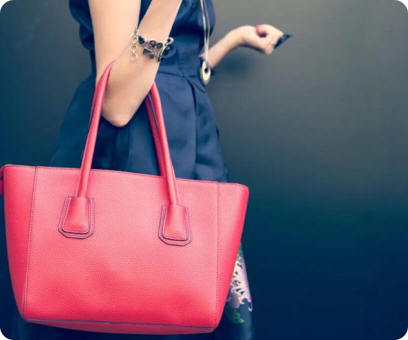
The homepage leads with product UI: a client list, an “Order shared” confirmation and a styling appointment, with small product shots. Photography lives mostly on customer stories and resources: stock lifestyle and in-store scenes, from a woman by a pool to a curbside pickup.
The logo wall does the work the imagery doesn’t. Max Mara, D&G and David Yurman lend the prestige, so Tulip borrows it from its clients instead of building a world of its own.
The pictures are competent but interchangeable, and none of them is art-directed around the clienteling moment.



Digital Comms
Tulip’s social presence is LinkedIn (17.6k followers, the largest audience in the set). We found no Instagram or YouTube, and X needs a login.
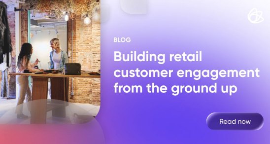
- A steady stream of thought leadership: blog posts, the clienteling benchmark report, webinars and events.
- Branded cards in the website’s purple and violet keep every post recognisable.
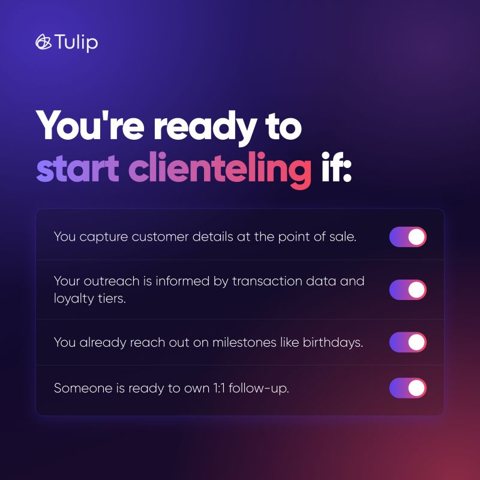
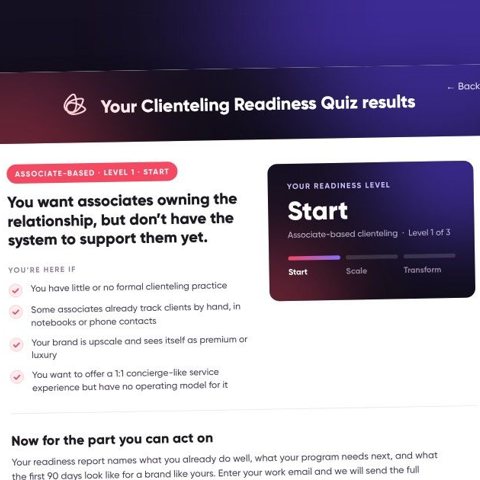
- Most posts are about Tulip’s reports and product. Photography appears only as a backdrop to headlines.
- No visual channel, such as Instagram or video, for a brand that sells to fashion.
The biggest audience in the category, used as a corporate newsroom.

Identity
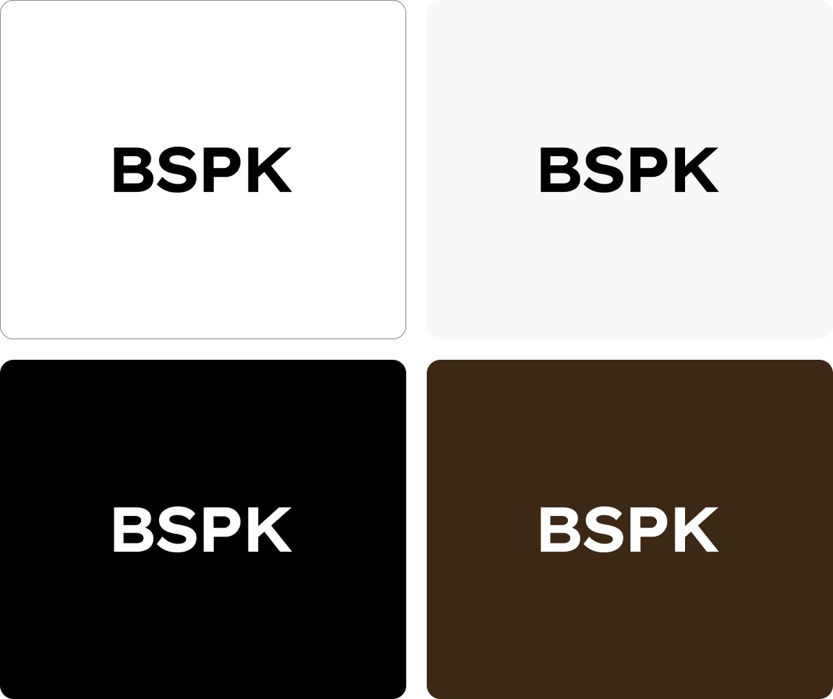
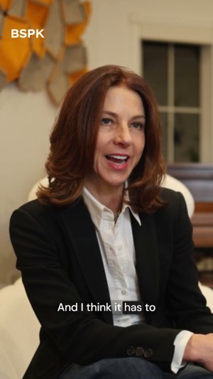
A pure wordmark: BSPK in a heavy grotesk, black on white, no symbol. Short and assured, it behaves more like a fashion label’s monogram than a software logo, which suits a name that comes from “bespoke”.
- Restraintfour letters and no ornament let the photography lead.
- Fashion codeblack, uppercase and compact, it sits naturally next to the luxury names on its logo wall.
- Anonymitythe letterforms have no detail of their own. Out of context, BSPK could be a logistics company.
- Lost meaningthe acronym hides “bespoke”, the one idea that would make it memorable.
Website
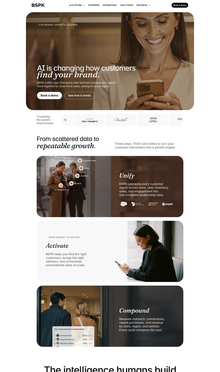
The most editorial homepage in the category.
- Layoutphotography leads, with rounded image cards and generous space.
- Storythree steps (Unify, Activate, Compound) that are easy to remember.
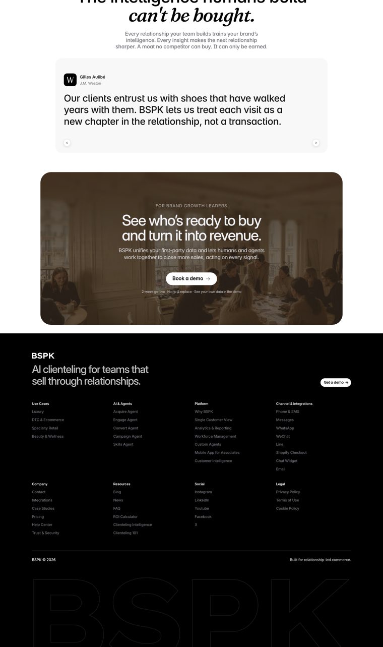
- Proofclient quotes from J.M. Weston, Bonpoint and Hermès, each given room of its own.
- Messagethe hero has moved to AI (“AI is changing how customers find your brand”). The store and the associate are almost absent from the copy.
- Contrastdark, low-contrast imagery makes some sections hard to read.
BSPK is the benchmark for the look we want, and a reminder that a look alone is not a position.
Typography
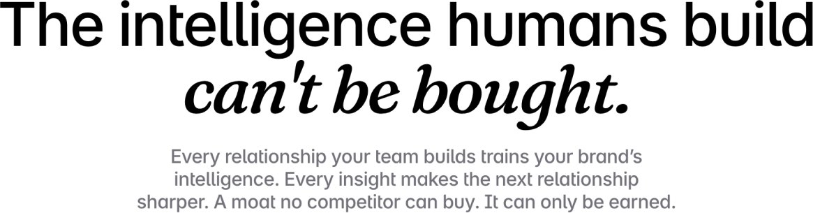
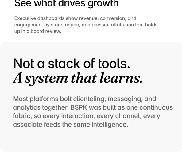
Inter for almost everything, with Fraunces Italic reserved for the key words of each headline: “find your brand.”, “repeatable growth.”, “can’t be bought.”
- Editorial pairingthe italic serif accent is a magazine device. It gives the sans headlines a voice and a rhythm.
- Consistencythe same move repeats in every section, so it becomes a signature.
- Interthe main face is still the SaaS default; the editorial character lives in a handful of words.
- Frauncesa free, widely used variable serif. The device is ownable; the typeface isn’t.
- Display
- Inter Medium + Fraunces Italic
- Text
- Inter 400 · 500
- Accent
- Italic serif on key words
Photography
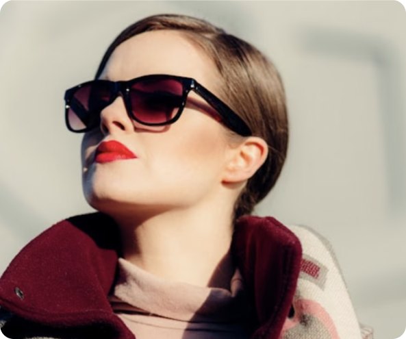
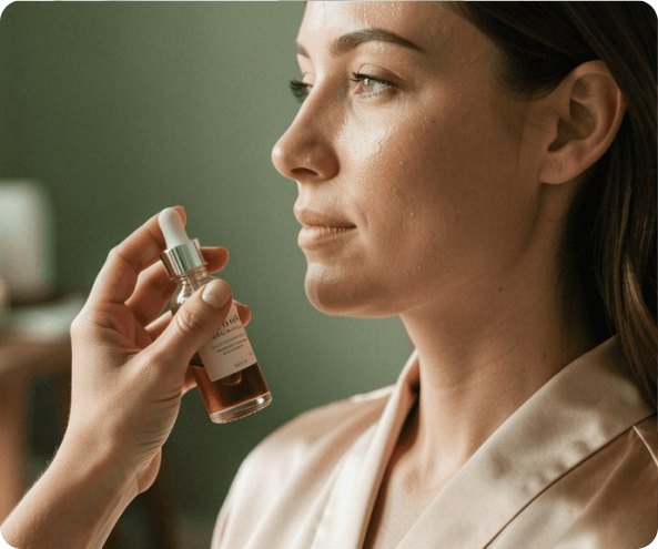
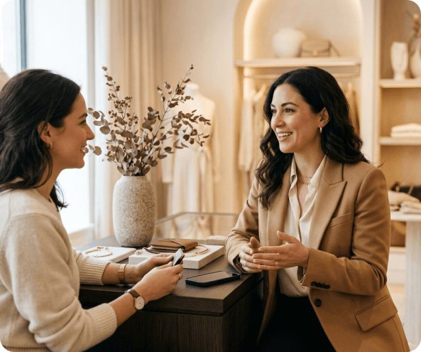
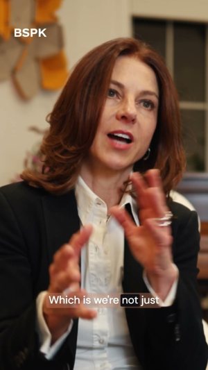
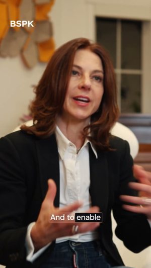
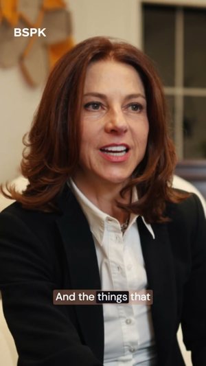
The strongest photography in the set, and the only one that shows the clienteling moment: a client on her phone, a couple leaving a boutique, an advisor and client side by side, a team meeting in a Parisian salon.
Warm, low-light and slightly cinematic, with a brown cast applied across every image so they read as one series.
This is the territory closest to what Jean is asking for. If we go editorial, BSPK is the competitor we will be compared with.

Digital Comms
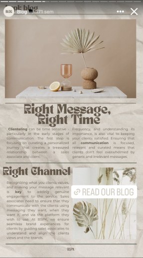
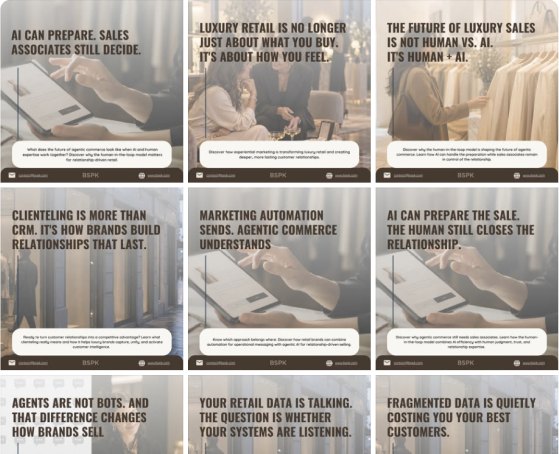
@bspkagentic is the most active presence in the set: 3.5k followers on Instagram and 2.2k on LinkedIn.
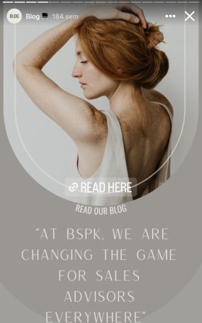
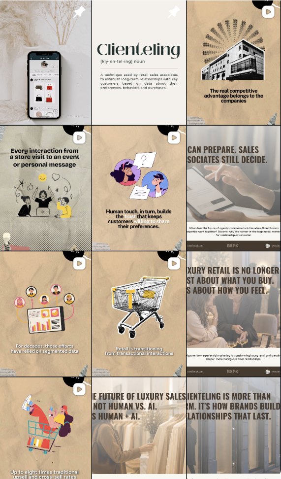
- A look of its own on Instagram: aged paper, newspaper type and collage, carried across stories and feed.
- Clear teaching themes, such as “Right message, right time”, that position BSPK as the expert on clienteling.
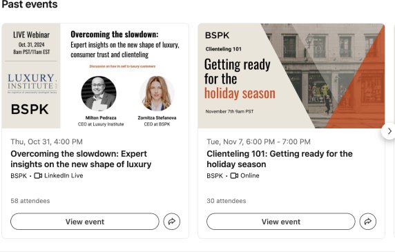
- LinkedIn events promote a regular webinar programme, from market outlooks to Clienteling 101.
- Instagram and the website look like two different brands: vintage collage on one, cinematic photography on the other.
- Mostly text on image; the photography that makes the website strong rarely appears.
Digital Comms
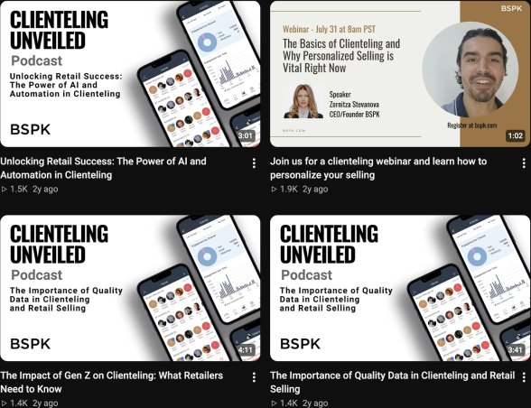
Facebook (8 followers) reposts the Instagram cards. YouTube @BSPKagentic is the largest channel: 3.6k subscribers and 652 videos.
- The Clienteling Unveiled podcast gives BSPK a recurring, recognisable format.
- Video covers follow one template: bold black type with the product shown on a phone.
- Facebook adds nothing that Instagram doesn’t already show.
- Three channels, three visual styles: cinematic on the site, vintage collage on Instagram, product mock-ups on YouTube.
BSPK invests the most in social, but the brand changes face on every channel.
Identity
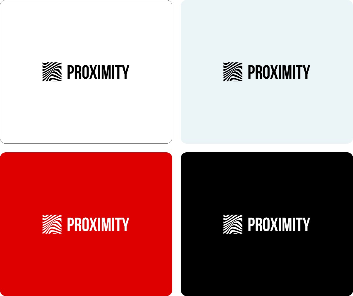
A combination mark: a square of flowing contour lines, part fingerprint and part topographic map, next to PROXIMITY in a condensed uppercase sans. Bold and graphic, it is the most designed symbol in the set.
- The symbolcontour lines suggest closeness and individuality. It holds at small sizes and works as a pattern, as the red hero shows.
- Presencehigh contrast and very legible.
- The wordmarkcondensed caps feel sporty and loud, closer to a gym than to the luxury retailers Proximity serves.
- Two worldsan organic, fluid symbol next to a rigid, compressed wordmark.
Website
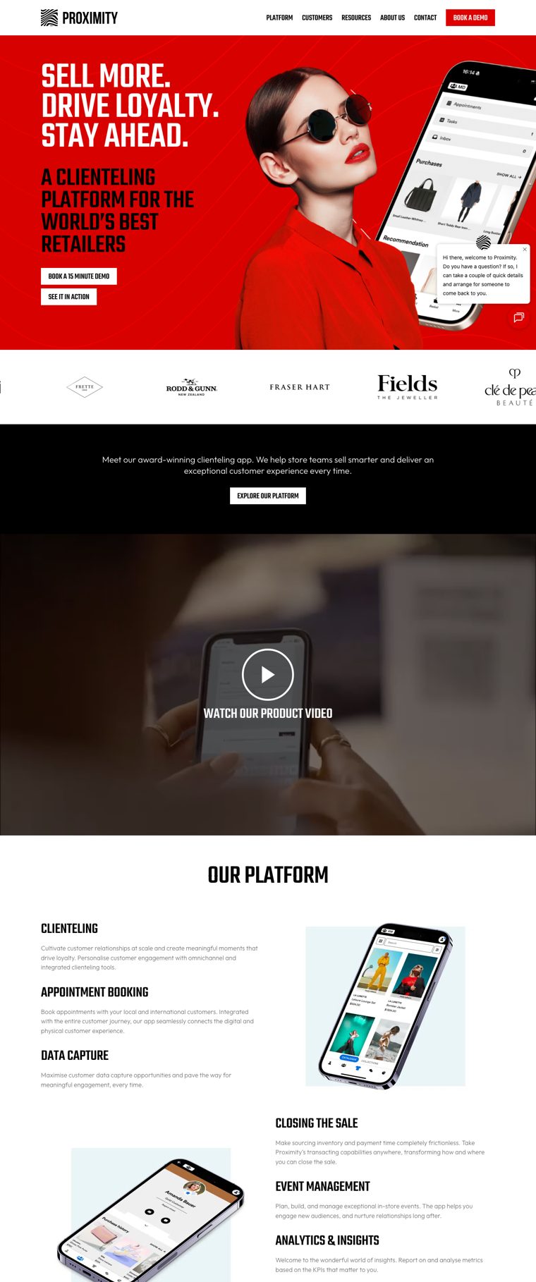
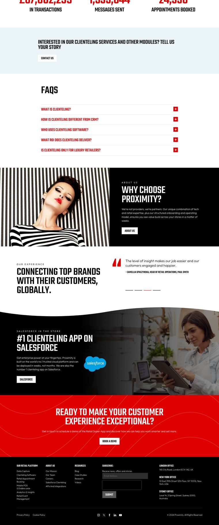
Loud, direct and very recognisable; the least premium of the fashion-facing brands.
- Herothe red hero with a model in red sunglasses is impossible to miss.
- Proofseven industry awards on the homepage, clients from Max Mara to Paul Smith, and “the number 1 clienteling app on Salesforce”.
- Registershouting caps and red everywhere sell urgency rather than service.
- Structurebelow the hero, a generic feature list, a product video and a long FAQ, with little to hold them together.
Typography
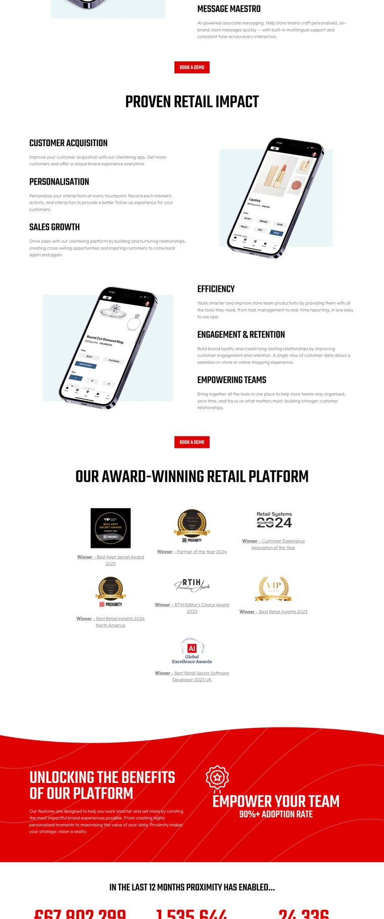
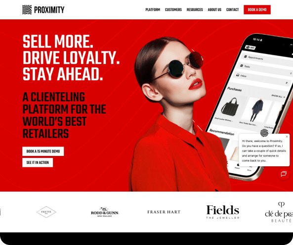
Teko, a condensed display face set in uppercase for every headline, with Outfit for text.
- Impactshort, stacked, all-caps headlines are impossible to miss.
- Registercondensed caps shout. They come from sport and retail promotions, not from the fashion houses on Proximity’s client list.
- Readabilitylong uppercase lines in a condensed face are tiring past the hero.

- Display
- Teko Light, uppercase, 100/80
- Text
- Outfit 300 · 400 · 700
- Case
- All caps for headlines
Photography
A mix of fashion editorial and lifestyle stock: a model in a striped top against a striped wall, friends laughing over a phone, an associate with a tablet on the shop floor. On the homepage, a model in red sunglasses sits on the red hero.
- Fashion credibilitythe studio shots are styled like a fashion label’s campaign, which no other brand in the set attempts.
- Two registersstudio editorial sits next to generic stock, so the series never reads as one world.
- Model, not clientthe strongest images show fashion, not the relationship. Nobody in them is advising or being advised.



Digital Comms
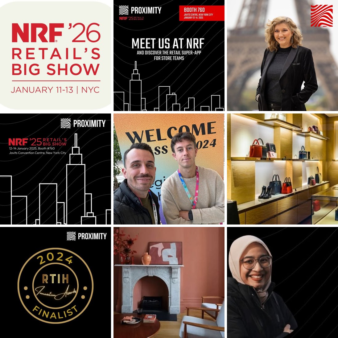
A small, quiet presence: 112 followers on Instagram and 45 on Facebook. Most Instagram posts date from 2024.
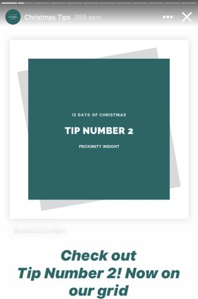
- Instagram stories reuse the brand’s colour blocks, so they are easy to recognise.
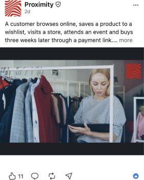
- LinkedIn pairs retail news and client stories with in-store photography.
- Tip series (“Tip number 4”) and reposts make up most of the content; there is little original material.
- Nothing on social matches the energy of the red website hero.
Digital Comms
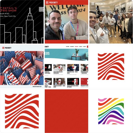
Facebook and YouTube carry event and product content.
- Facebook makes the most of the red: the contour-line pattern and trade-show photos from NRF are on brand.
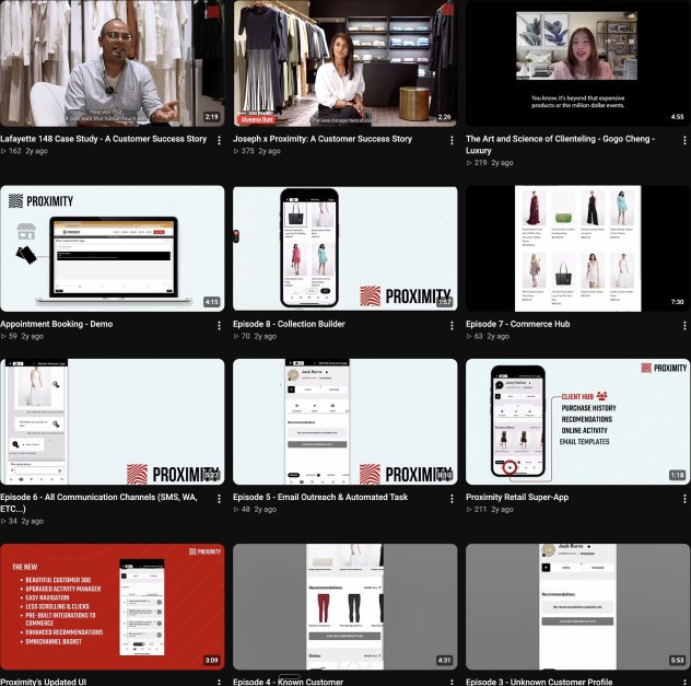
- YouTube shows the product in use, through screen recordings, short demos and webinar recordings.
- YouTube thumbnails mix red covers, black frames and raw screenshots, with no template.
- Audiences are small and posting has slowed.
Proximity’s red works on social. What is missing is a reason to follow.

Identity
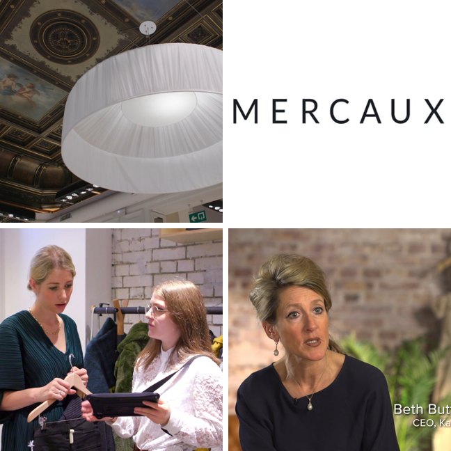
A pure wordmark: MERCAUX in thin, widely tracked capitals. It borrows the code of a luxury label, but in slate grey on a near-black ground it all but disappears.
- Luxury codewide tracking and capitals are the language of fashion houses.
- Fragilitythe strokes are too thin to hold at small sizes, and the letters have no detail of their own.
- No systemnothing on the site derives from the logo; it could be swapped without anyone noticing.
Website
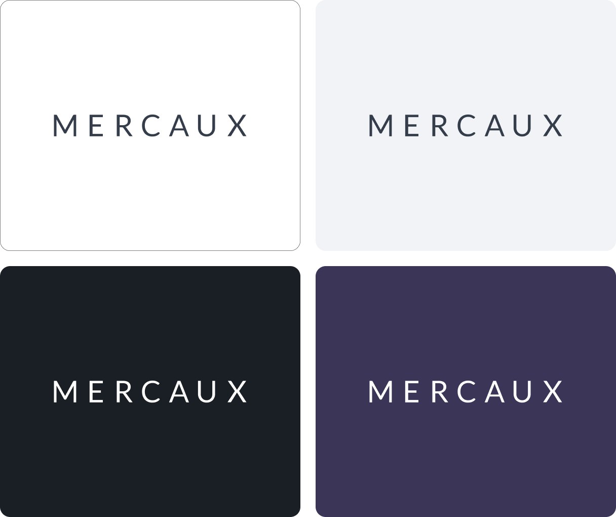
An enterprise technology site rather than a retail brand.
- Positioninga clear story around data, AI and unified commerce (“Transform Shopping Experiences with Data and AI, In-Store & Remotely”).
- Clientsstrong logos, including Foot Locker, River Island, Jigsaw and COS, plus named quotes such as one from Jigsaw’s CEO.
- Heroa dark gradient with blurred colour blobs and no image.
- Densityisometric diagrams, long feature lists and too many colours compete on every screen.
Mercaux speaks to the CIO. Nothing on the page speaks to the person on the shop floor.
Typography
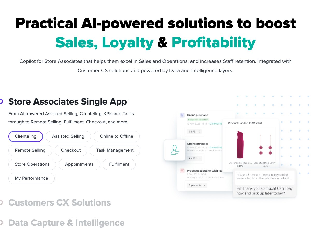
Proxima Nova across the board, mixing Light for the hero and Extrabold for section headlines, with gradient-coloured words.
- Legibilitya safe, readable sans.
- InconsistencyLight and Extrabold headlines alternate without a rule, so the page has no typographic voice.
- Proxima Novathe most used web sans of the 2010s, now dated and generic.

- Display
- Proxima Nova Light / Extrabold, 60px
- Text
- Proxima Nova Regular
- Accent
- Gradient on key words
Illustration
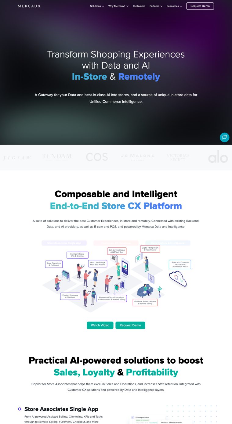
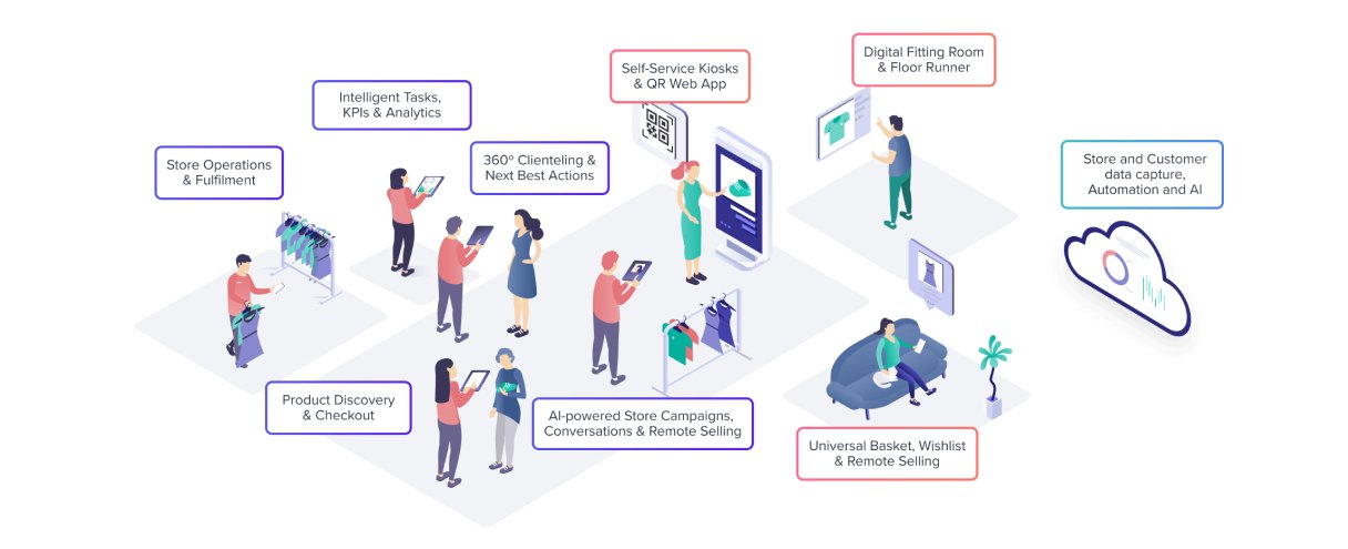
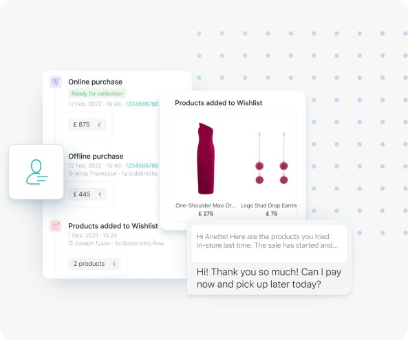
Illustration carries the homepage. Mercaux draws isometric scenes of shoppers and associates surrounded by labelled boxes, alongside floating product UI cards.
The isometric style dates the brand to around 2018 and turns the store into a diagram. It explains the platform but removes the emotion from retail.
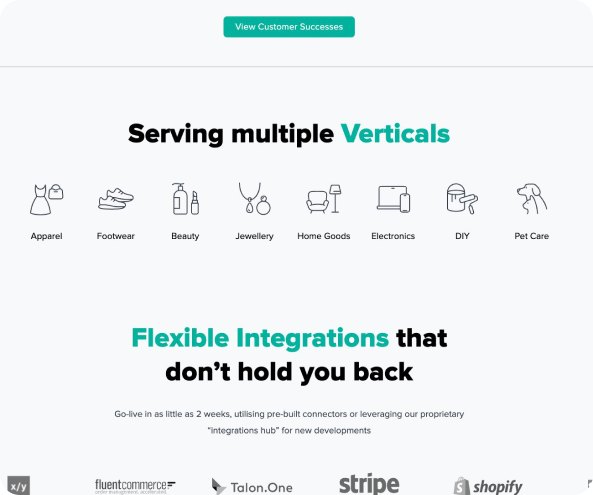
A line icon set for its verticals (apparel, footwear, beauty, jewellery) is the only consistent graphic system on the page.
Photography
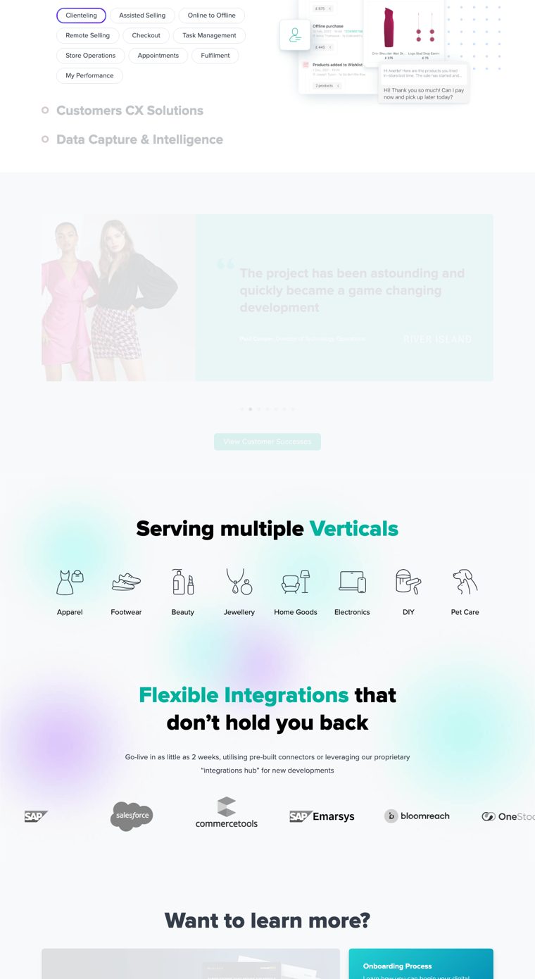
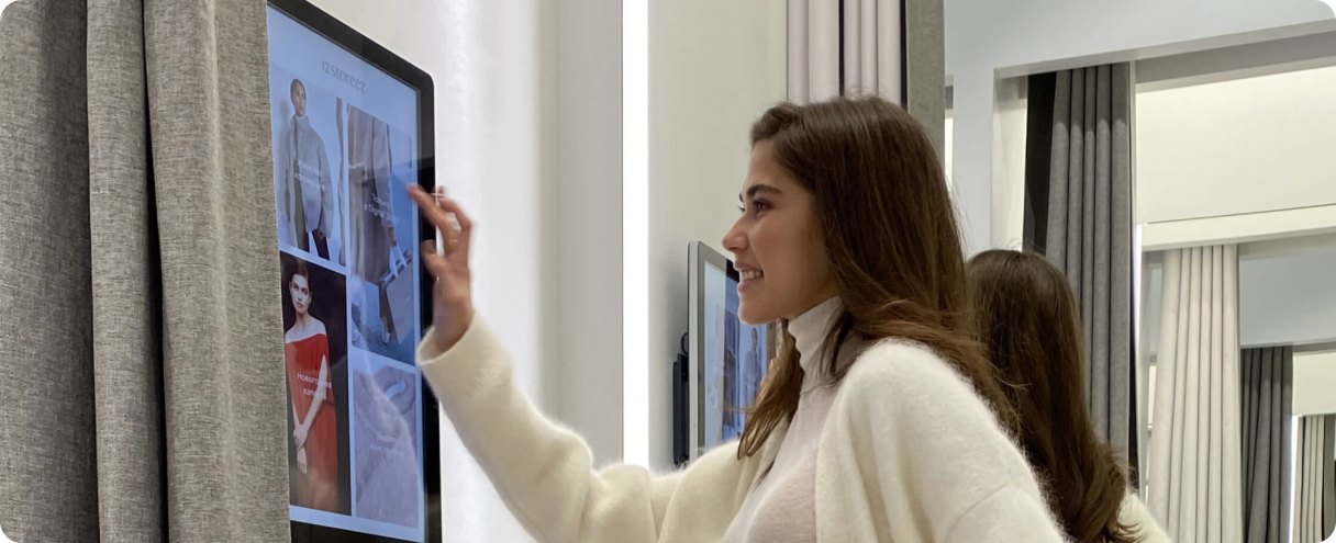
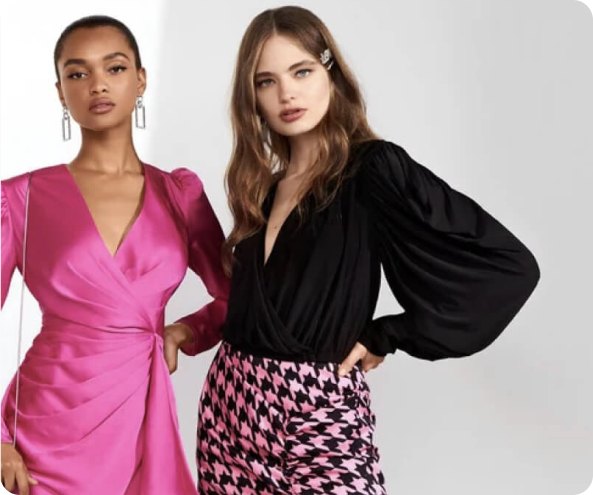
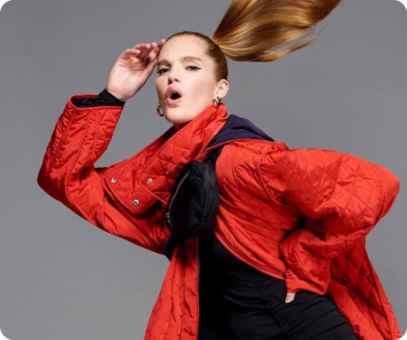
Two kinds of photography: product-in-use shots of Mercaux technology in stores, such as a shopper at a smart fitting-room mirror, and bright studio fashion images on the vertical pages.
- Product in contextthe fitting-room shot shows the technology inside a real store moment, where most competitors only show UI.
- Stock fashionthe studio models are generic catalogue images with no link to the brand or to clienteling.
- No seriestwo unrelated styles, with no shared light or colour treatment.
Digital Comms
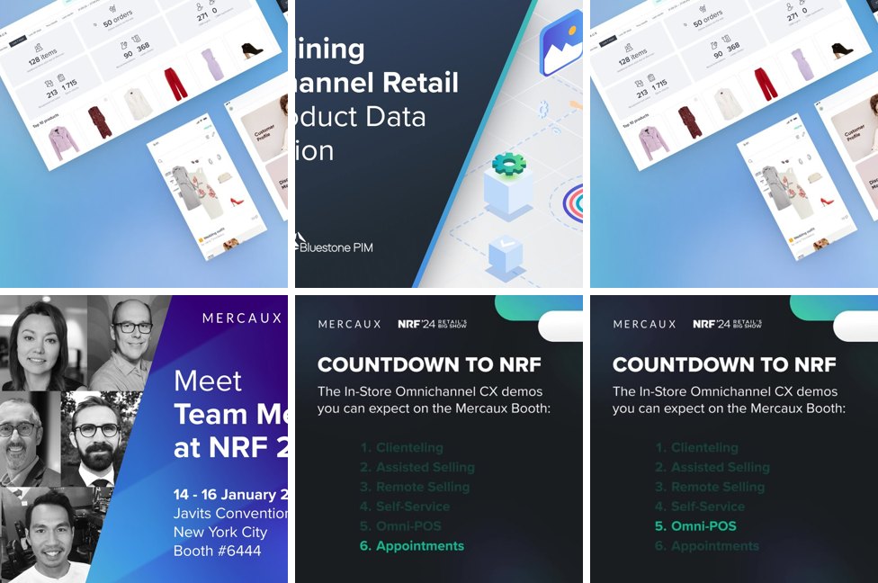
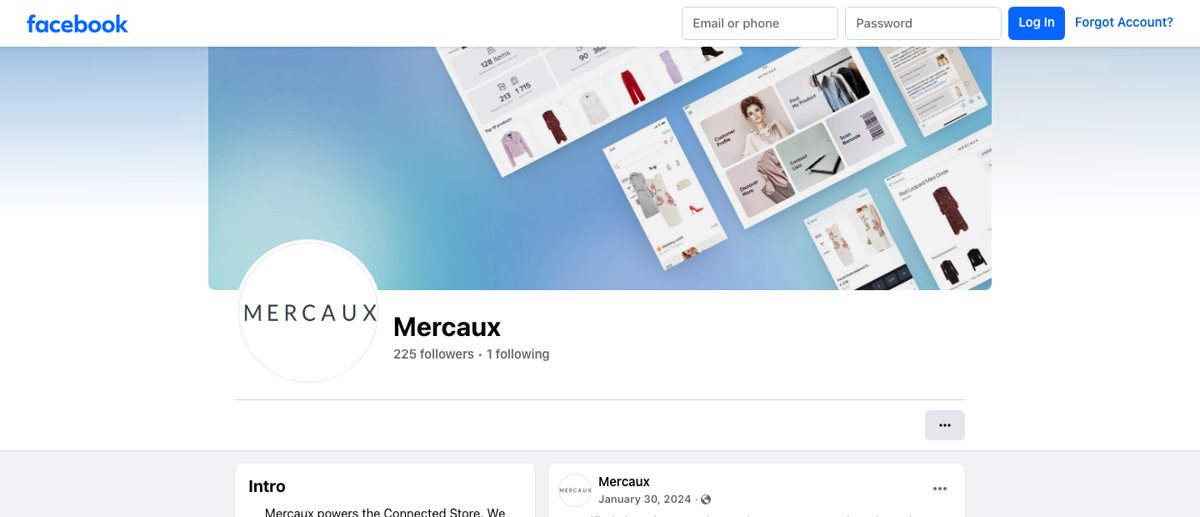
The quietest presence in the set. Facebook has 225 followers, the YouTube channel has no videos, and product films live on Vimeo. LinkedIn is the main channel but sits behind a login.
- Vimeo hosts polished product films of the Store Associate app.
- Facebook covers reports, partnerships and events.
- No visual channel aimed at store teams or shoppers.
- No consistent templateposts mix photos, report covers and screenshots.
Mercaux uses social as a press office.
Identity
A combination mark: a sky-blue rounded square holding a white quill, next to Clientbook in a bold geometric sans. It reads as an app icon plus its name: clear, and entirely generic.
- Clarityeasy to read, and the symbol doubles as an app icon.
- The quilla nod to the “book” and to handwritten client notes, and the only symbol in the set with a story behind it.
- App-store lookrounded square, primary blue, geometric sans. It is the default kit of a consumer app.
- Mismatchit sells to luxury jewellers, but nothing in the mark is luxurious.
Website
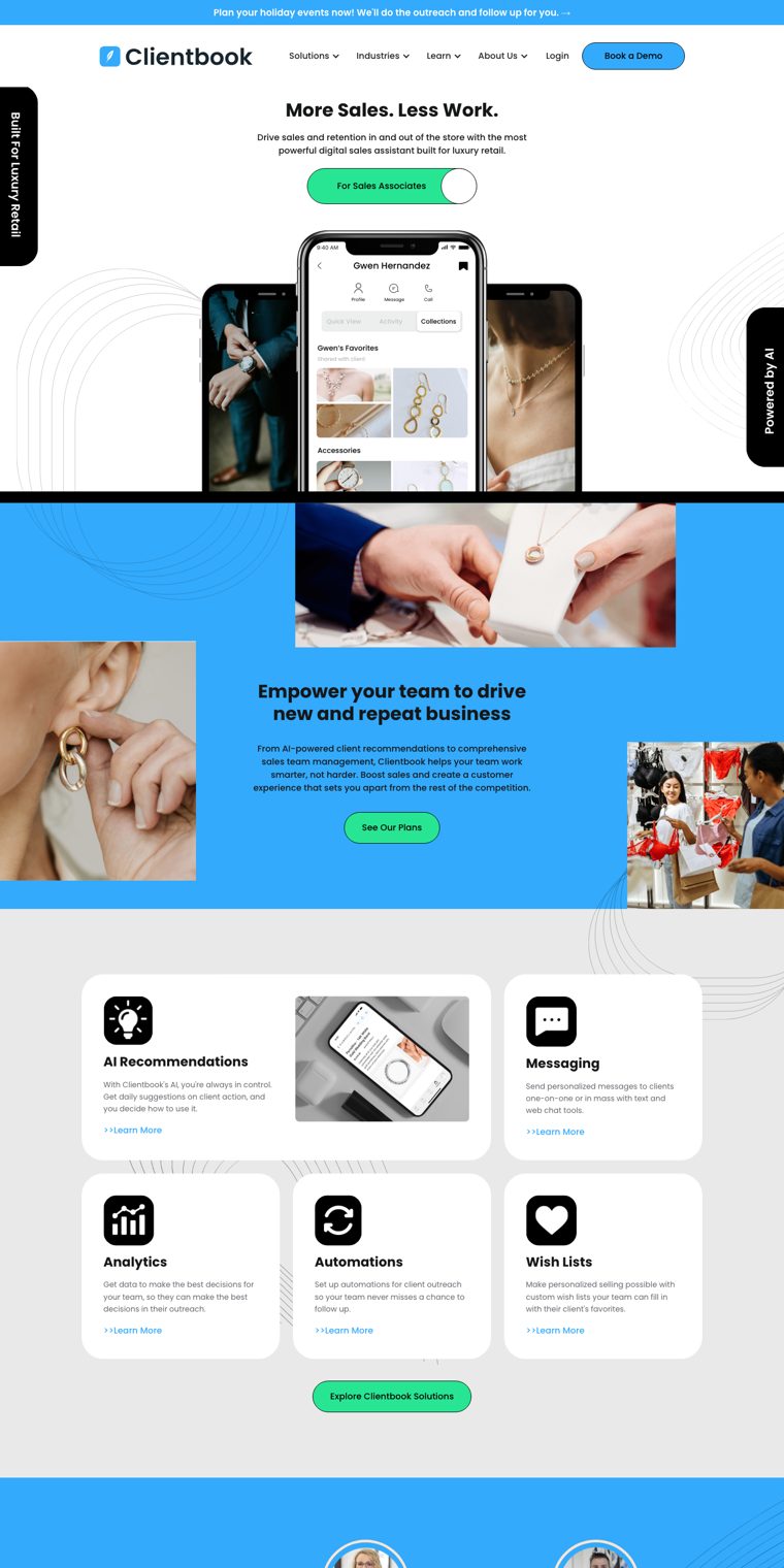
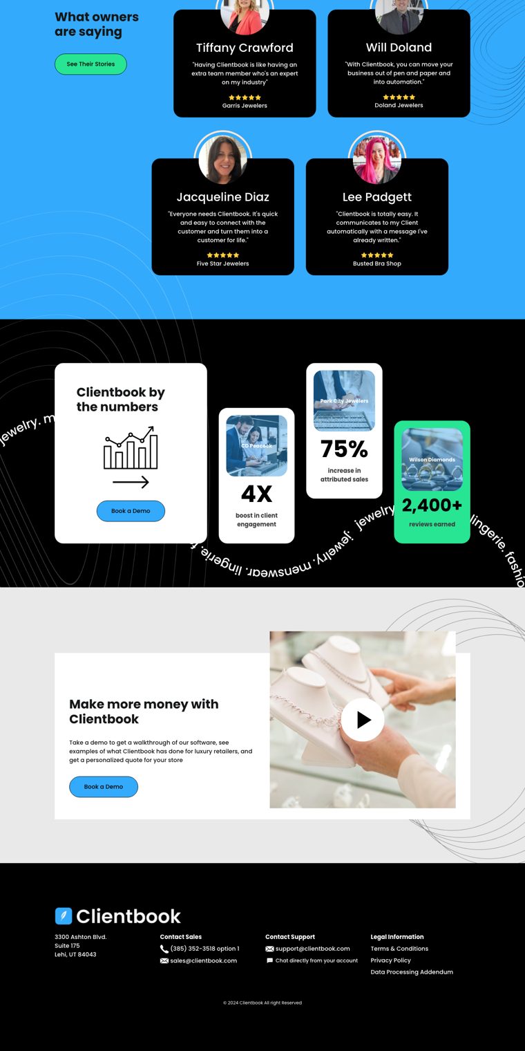
The most small-business site in the set: friendly, busy and direct.
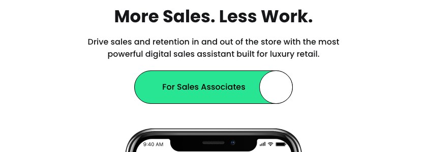
- Promise“More Sales. Less Work.” is clear in three seconds.
- Proofowner testimonials with names and photos, and hard numbers (4X client engagement for CD Peacock, 75% more attributed sales for Park City Jewelers).
- Busyblue bands, mint buttons, black blocks and line patterns compete on every screen.
- Template feelstock imagery and off-the-shelf components make it hard to read as premium, even though it sells to luxury retail.
Clientbook wins on approachability and loses on everything else.
Typography
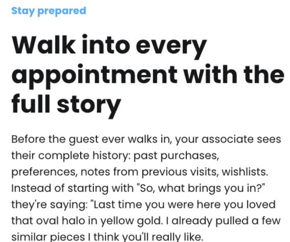
Poppins in four weights for everything, from 34px headlines to buttons.
- Friendlinessround, open and easy to read, it suits a small-business audience.
- Poppinsfree, everywhere, and closely associated with templates and start-ups.
- Scaleheadlines at 34px are small for a homepage, so there is little typographic hierarchy.
- Display
- Poppins Bold, 34/37
- Text
- Poppins 400 · 500 · 600
- Weights in use
- 4
Photography
Close-up stock photography of jewellery (hands presenting a necklace, an earring being put on, pieces on display busts) mixed with phone mock-ups.
- The gesturea hand presenting a piece to a client is a genuine clienteling moment.
- Stockrecognisably stock and cropped into blue panels; no art direction holds the series together.
- Decorationline drawings and rotating text badges add noise rather than meaning.



Digital Comms
YouTube is Clientbook’s main social channel. No accounts are linked from clientbook.com, and we found no Instagram.
- Useful content for its audience: Clientbook University tutorials, product deep dives and event playbooks for jewellers.
- One thumbnail templateClientbook blue, bold type and a presenter on camera.
- Webinars and tutorials only; nothing shows the stores or clients Clientbook serves.
- Episode-style covers and generic backgrounds make the channel feel like a training library.
On social, Clientbook is a help centre rather than a brand.